
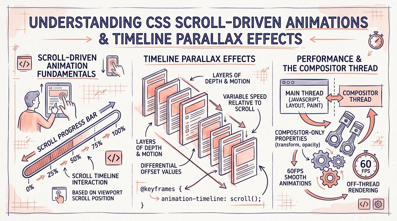
Scroll-based animations have historically been one of the biggest causes of frontend performance bottlenecks. In 2026, the native CSS Scroll-Driven Animations specification replaces third-party scroll listeners with pure, GPU-accelerated styling.
1. The @keyframes and animation-timeline: scroll() Paradigm
With modern CSS, an animation progress can be directly tethered to the scroll position of a viewport or container rather than elapsed clock time: Jab pehle parallax animations ke liye scroll event listeners lagane padte the, page frame rate bohot drop hota tha. Ab bina kisi heavy scroll library ke pure CSS se 60fps animations implement karna bohot aasan ho gaya hai.
CSS (Scroll-Driven Progress Bar)
.reading-progress-bar {
  position: fixed;
  top: 0;
  left: 0;
  height: 4px;
  width: 100%;
  background: var(--color-accent);
  transform-origin: 0 50%;
  animation: scaleProgress auto linear;
  animation-timeline: scroll(root block);
}

@keyframes scaleProgress {
  from { transform: scaleX(0); }
  to { transform: scaleX(1); }
}
2. Element-in-View Reveal Effects with view()
Instead of hooking up IntersectionObserver in JavaScript to fade in cards as they enter the screen, CSS provides the view() timeline:
CSS (Scroll Reveal Cards)
.feature-card {
  animation: revealCard linear both;
  animation-timeline: view();
  animation-range: entry 15% cover 35%;
}

@keyframes revealCard {
  from { opacity: 0; transform: translateY(40px) scale(0.95); }
  to { opacity: 1; transform: translateY(0) scale(1); }
}
💡 Performance Win: CSS Scroll-Driven Animations run directly on the browser compositor thread. Even under heavy JavaScript CPU load, scroll effects remain butter-smooth at a locked 60fps.